CONCEPT/ART DIRECTION/DESIGN – 2022
MBrace Therapeutics Business Card Refresh
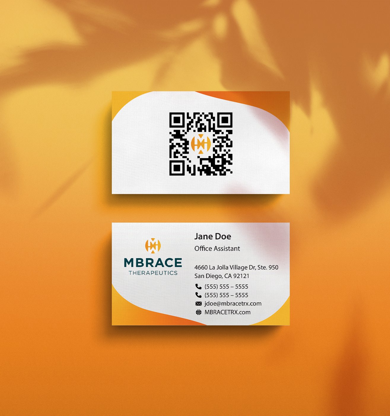
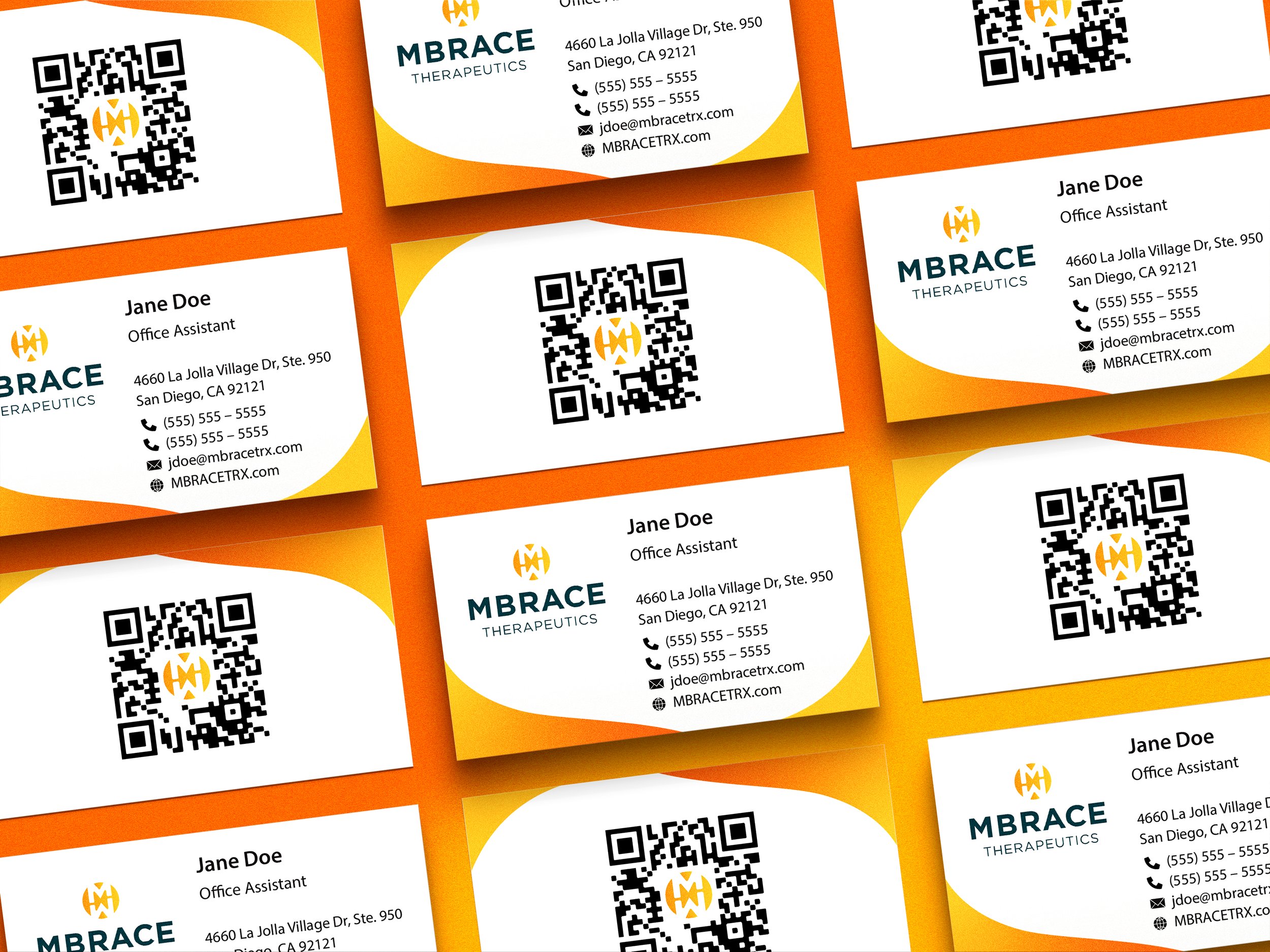
In the Fall of 2022, MBrace Therapeutics reached out to me for help giving their business card design a refresh. Working directly with the client, we determined a new visual design utilizing their brand colors, as well as an added element of function by incorporating QR codes customized to each individual employee.
IMAGES BELOW


How can we spruce up MBrace’s business cards while adhering to their existing branding?
PROBLEM TO SOLVE
Employ a friendly and soft-shaped frame using the brand’s colors to subtly elevate the brand’s image in print.
SOLUTION
The card’s previous design was pure white, featuring solely the logo and contact information. While this design was functional, it lacked the warmth and personality of the brand, a therapeutics company dedicated to developing new treatments for cancer located in sunny southern California.
To breathe a little life into the card’s design, I created a soft wave-like frame with a gradient of the brand’s two key colors. For enhanced clarity of information, QR codes were added to the backs of each card which, when scanned, take the scanner to a page featuring the MBrace employee’s contact information.
